I’ve been down a rabbit hole looking for insights into understanding the design of audio visual compositions. I may be some time.
Integrated approaches to audiovisual creation and analysis
So far, my study list on audiovisual as an integrated subject of study looks like so:
See this Sound Audiovisuology Compendium : an Interdisciplinary Survey of Audiovisual Culture · Volume 1, which is partly available as a web archive. (There have been subsequent editions but I realised I couldn’t access them.). After reading this all the way through, I realised I needed to read Chion, as everyone kept citing him.
Audio-vision – Sound on Screen by y Michel Chion · 1994
Digital harmony – On the complementarity of music and visual art – John Whitney – I’ve popped a hot take on this up up on Goodreads
Visual aesthetics
These foundational works are mostly focussed on static composition but there’s more than enough here to be getting on with for the moment:
Art as Experience – John Dewey
Art and visual perception – Arnheim
I am so enjoying Dewey – makes me nostagic for the days when psychology and philosophy were not so far apart. Arnheim is interesting but sometimes his subtle phenomenological judgements about balance and tension etc etc in form leave me cold, rather than adding a new dimension of insight. So I introduce a lot of red pen marginanial which is all a variation on “sez him” vs “sez me”. I find myself wishing for an explanatory mechanism, or at least a theory or some kind. Which I find funny, as it’s not my usual ask.
Music
This is a big rabbit hole. Perhaps oddly, I’ve started with
I haven’t finished it yet but from making progress by little dips I think that it is designed to expand Western formal traditional conception of music – which is something I don’t actually have a great big pile of in my head, so the premises miss me a bit. It’s trying to dynamite something that isn’t there! Nonetheless, it’s stirring things around and I’m enjoying trying to reverse engineer the things it assumes I already know.
So, without letting go of my trail of bread crumbs, I think what I need to backfill afterwards is:
Leonard Bernstein, The Unanswered question, a sxi part lecture series which is available as text and as a video, starting here.
My musical training – from a piano teacher I didn’t see eye to eye with – never touched on music theory, so there’s a fair old bit of catch up to do.
Refik Anadol has made his name by producing super scale animations that rely on machine learning algorithms, a large cast of studio assistants, and meanings which are borrowed from the raw material consumed by the algorithms. His invited exhibition at the Serpentine in London, entitled Echoes of the Earth: Living Archive, takes over the whole of the Serpentine North Gallery, is totally eye-catching. The TL;DR is: go. Quickly. It closes April 7 2024.
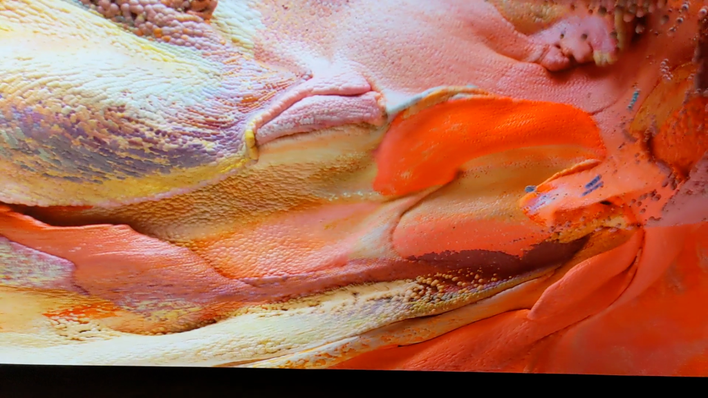
The images in the exhibit range from literal-seeming to highly abstract, and the animations which sequence them flow from one mode to the other. Everything is synthetic – the images are derived from applying machine learning algorithms to very large datasets of other, real images. On which more later. The results sometimes seem literal – as with this synthetic coral:
Coral-like image Refik Anadol Echoes of the Earth: Living Archive Serpentine Gallery London 2024
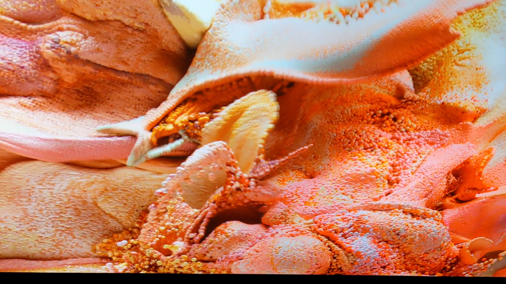
Sometimes the images produced by the operation of the models are highly abstract, as in this candy coloured image, which seems fluid-like and tissue-like, but does not obviously represent any particular thing:
Abstract multi-coloured particle-based image Refik Anadol Echoes of the Earth: Living Archive Serpentine Gallery London 2024
The animations often looks like they are driven by a fluid dynamics simulation. They proceed at a comfortable pace. The colour palettes are harmonious, the surface lighting is gentle. Because of the palette and palette transitions chosen, the sequences have a tendency to look “nice”.
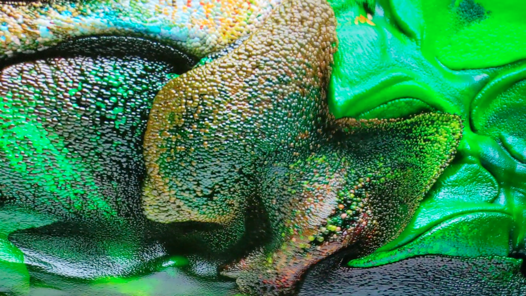
The visuals aren’t always explicitly representational, although the models which generate them use real image captures as inputs. But even when they aren’t interpretable as specific things, the outputs all have a biomorphic flavour to them, reflecting the characteristics of their inputs. Some sequences evoke associations of clouds of organic tissues in perpetual motion and transition. As indeed real weather and real tissues are.
Harmoniously coloured abstract image sequence – reminiscent of changes in weather and in living tissues Refik Anadol Echoes of the Earth: Living Archive Serpentine Gallery London 2024
Sometimes, the images flow from the purely abstract towards representational, then back off again. This gives the feeling of life-forms being created – and dissolving. The pace is slow enough that it doesn’t feel frenetic, rather graceful.
Synthetic creatures emerge from more abstract images – and dissolve again Refik Anadol Echoes of the Earth: Living Archive Serpentine Gallery London 2024
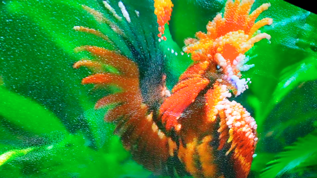
As is the way with the state of the art around synthetic ML-based images of beings, there are times when the synthesis creates “errors”, as seen in this bird with two beaks, and a foot whose claw doesn’t grip the surface:
Model outputs are driven by visual similarity not physical constraints – check the beak(s) and claws Refik Anadol Echoes of the Earth: Living Archive Serpentine Gallery London 2024
What are we to make of this? The images being synthesised and streamed together explore the latent space of the models – creating images of possible beings. The models are based on very very large datasets of actual images, but the model outputs are novel. Sometimes they create things which we instinctively understand would be unable to exist in reality.
In a way, these model “errors” serve to highlight the preciousness of actual life and beings. Not all corners of this very effortfully produced and highly dimensioned latent space are actually habitable. Visual representation is fundamentally a surface phenomenon, with only imperfect connections to mechanism.
Sometimes what is created is beautiful, as in this sequence of a lotus turning into a lotus:
The model dreams impossible dreams – of a lotus within a lotus Refik Anadol Echoes of the Earth: Living Archive Serpentine Gallery London 2024
There is treasure to be found in mining latent spaces, and Anadol and his team have certainly found some. Dreams, even deep ones, do sometimes turn to nightmares though. The potential for monstrosity, as well as beauty and impossibility, is equally latent in the technique.
The story of how the base data images are sourced, and how the resultant images are synthesised is very much a part of the work. Which is very much on trend. This display, which is part of the exhibit, dramatises the multitudes of base data images that went into creating the models:
The origin story is part of the work Refik Anadol Echoes of the Earth: Living Archive Serpentine Gallery London 2024
The works are made possible by the collaboration of an impressive number and range of institutional collaborators, such as the Natural History Museum, and the Smithsonian, who have collectively contributed millions of images from their own collections to be used as training data. Many of the works use what Anadol calls their Large Nature Model, a play on Large Language Models (LLMs) of ChatGTP fame. (This model is, apparently, open sourced – although, interestingly, I am not the only one who can’t find it on GitHub.) All the works seem to use NVidia StyleGan2 as the underlying model framework.
This is the first of Studio Anadol’s installations that I’ve seen in person. In concept and style it has strong links to his blockbuster 2022-23 installation, Unsupervised, at MOMA in NYC. Unsupervised was a never-ending generative machine learning-based animation using, as its raw material, 200 existing works in MOMA’s collection. This use of freely contributed material and generative ML-driven animations are common threads tying the the two exhibits together.
The MOMA installation was accompanied by righteous chat about it being “on the blockchain” – but times change. The Serpentine exhibition also surfs the zeitgeist, but doesn’t mention crypto. Now the force being harnessed is the sharp wind of eco-anxiety. This is somewhat ironic, given the compute power – and energy – which must have been involved in creating the exhibition’s works. Anadols’ explanation of the intent and process behind the highly collective work – of which the Serpentine exhibition is just the first public manifestation – was launched at Davos last year: you can check out the promo here.
So? It’s an eyeful, in a good way, and it represents boss levels of effort and collaboration. But the outputs – although they are “nice” – make me melancholy. In exploring the latent corners of a many thousand dimensioned model space built from a multitude of images of living things – what have we learned? That actual, working life is precious in its uniqueness? It’s a bold exploration, and it’s certainly uncovered some beauty, but I don’t feel the exploration has helped us, collectively, arrive anywhere. Yet.
Remember AR? After years of incubation in innovation labs, it’s still pecking away at the inside of its shell. The recent Herzog & de Meuron exhibit at the RA illustrates both the potential and pitfalls of AR/MR design. Ironic, in a way, that an exhibit so wholeheartedly about design – and the importance of model-making, concept co-creation, and process in design – also serves as a powerful illustration of the challenges of successful AR design.
Herzon and de Meuron is a Swiss-headquartered global architecture firm. Londoners might know them as the designers of the Tate Modern, the 2012 Olympics site master plan, and new Chelsea F.C. stadium. Amongst other projects. You’ve seen their work even if you didn’t realise it at the time. I went to the exhibition as I’m interested in architecture, in general, and am a fan of their work, in particular. And I also love architectural models. That H&deM had developed an AR app specifically to support the exhibition was, for me, initially just an amuse-guele. But the ways in which the app succeeded and failed turned out to be very interesting: they suggest a few principles for the AR grimoire, in the way of Do’s and Don’ts.
Magic
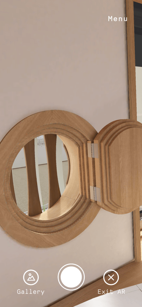
For me, the most exciting experience in the exhibition app was the full scale overlay on a real room sized model. The 3D model surface was plain white – when viewed with your eyes only. Viewing the model surface via your phone (and via the app), you saw a set of decorative elements superimposed on the blank contours of the model, rendered with appropriate shadows.
H&dM RA exhibit 2023 app Screen capture of AR view of room scale model Project 377 There is no wood trim – it’s AR
This model is taken from the design process of the (beautiful) Kinderspital (Children’s Hospital) in Zurich, a project that H&deM have already put over a decade’s worth of work into. Of course, full scale models aren’t always feasible in prototyping work. But when dealing with such a diversity of stakeholders – patients, researchers, staff, benefactors – I can see they could be useful in helping to reveal preferences and needs.
However, what struck me most about this work wasn’t that it was useful. Or even that it was beautiful. It was – simply – that it was magic. It was magic to see the normal world transformed, in real time, at real scale, and believably – by simply by viewing it through the lens of my phone. It’s typical that AR apps superimpose views of digital objects over your view of the real world. Dinosaurs roam football stadia. Butterflies flit in the auditorium. Pleasantly surreal, yes, but not magic.
What made this magic as an experience was the experience of a total integration of the 3d physical world and the AR overlay. I could move from side to side, and look up and down, and walk, and the overlay correctly preserved registration of the service, and the perspective I would see it from. It really seemed to be there – and part of my physical environment, in a normal way. It was the simple normality of it that I found to be magical.
Maybe not everyone finds fake wood trim so exciting. But the principle of perceived integration with the constraints of the physical environment is something that can be applied more broadly. The dinosaur in the stadium can bump its head on the stands. The butterfly can emerge from projection mapped 2D into 3D free space. Simple AR stickers that float context free simply don’t have the same persuasive power.
Can research create magic? After years (er, decades…) of doing an entertaining variety of different types of reseearch, I’d say probably not. It can certainly improve alignment between the realisiation of a service or product and the needs of its users and investors. Also, research can – in time – be used to generate, articulate and refine design heuristics that are useful in mapping out more and less promising areas of a design space, and in explaining – in hindsight – why some things work and others don’t.
The mundane: people do the darndest things
There’s also the more low level but very useful approach to design research, of just plain old seeing what people do when they are faced with a design they can interact with. A prototype design is fine – as H&deM well know, as they have based their core architectural design process on exploration. There is very little in design that doesn’t benefit from being wind tunnelled by actual ordinary people, and their actual ordinary confusions and behaviours. This holds for apps as well as architectural designs.
So, seeing people at the exhibit trying to interact with the AR app – and failing – was very instructive. It would have been great if H&dM had been able to really check out how people used their AR app before setting it loose on the world, as the issues I saw just from watching people for a half hour or so were pretty easy to fix. I’d batch all the snags into the same bin, as discovery problems, basically:
How do you make it go? Is this all there is?
Generic discovery challenges with the H&deM AR app
How do you make it go?
AR-enabled exhibits were indicated by a non-functional icon on the exhibit card H&deM RA Exhibit 2023
The symbol indicating the availability of an AR layer to an exhibit was an icon of a sphere in a box. I saw one gallery-goer aim his phone at the icon on the exhibit card, expecting it to activate the AR experience. Not unreasonable – in hindsight. However, the icon was just a signal that you needed to search elsewhere in the display for a QR code card. Not everyone discovered this. Separating the actionable cue (the QR code) from the informational cue (the icon) kept the information card for an exhibit looking lean, but introduced an extra step not everyone knew to take.
Is this all there is?
Once the QR code had been located, sometimes there was an extra challenge, which was to understand whether or not you were seeing what you were supposed to, and what it was. There was one exhibit where the overlay wasn’t visible until you backed up almost into the facing display case. From what I could see of how people were using the app, most people didn’t usually discover there was any there there.
There was another exhibit, where what you saw was just a label for one of the exhibits. But of course that might have meant I missed. the point – as it seemed quite pointless. There were a few more exhibits where AR “stuff” floated above the physical exhibit but its relationship to the physical layer was unclear.
What the AR app showed was sometimes quite mysterious H&deM RA Exhibition 2023The relationship of the AR overlay to the physical exhibit wasn’t always obvious H&deM RA Exhibition 2023
Part of the fun of exploring an AR layer for a display of architectural models is that there aren’t any rules about what to expect to see in the layer or how to interact with the layer. Fundamentally it’s going to be a discovery exercise. But the sheer variety of options presented in the H&deM app – often without much or any cuing – made it difficult for me to know whether I was actually seeing something “as designed” – or whether I’d managed – somehow- to miss the point entirely.
These confusions about the use of the exhibit app aren’t complicated ones – they are easy to detect by observing how people interact with the app. They are also solvable in various ways. More explicit cuing off-app could be useful- and damn the torpedoes around keeping the real world graphics lean and mean. And a more limited (and therefore predictable) repertoire of options for what the AR overlays disclose would also help people onboard to the experience more easily.
C’est magnifique, mais… qu’est que c’est que ça?
There was another digitally enhanced exhibit I enjoyed just as much as the room scale fake wood trim. I’m not sure if you’d call it AR. It probably isn’t. But it’s lovely. It’s an exhibition-wall-scale diagram of a floor plan for the Kinderspital in Zurich. I’ve never seen a plan that big. For massive projects, on a plan this big you can see features that would be invisible at other scales. I’m intrigued to think of how this might help people understand how the design works, or how to build it efficiently. (I’m not actually sure what the answer might be. Needs a bit more thinking.)
Not only is it impressively massive, but it has projection mapping overlays that change and pick out and highlight different aspects of the design. I found it interesting even without the overlays. But the overlays are certainly a delightful icing.
Grand scale visualisation of a grand scale project H&deM RA Exhibition 2023Multiple views highlighting different aspects of the plan are delivered via projection mapping H&deM RA Exhibition 2023
So it’s magnificent, oui oui, but is it AR? Yes, in a way, in that it’s a combination of physical – in this case, a giant scale plan of a giant building – and digital augmentation, delivered through the various projection mapping overlays that are possible. No, in a way, as it seems like pretty straightforward static data visualisation with multiple viewing options – albeit at a truly heroic scale. One element is physical and the other digital, so it is “digitally augmented”, but the same effect could be accomplished – less heroically – with an overhead projector. I think part of my feeling that it’s not “real” AR is that it doesn’t do anything. But architectural models typically don’t, on their own, do anything. Their usefulness comes from their ability to support thinking about them, and simulating experience. The interactions it supports are open ended, and non specific. However the potential now exists to do more, and have the model participate more actively in interactions with it. With advances in adoption and capabilities of BIM (building information modelling), I think we can look forward to more and even better interactive capabilities where this came from in future.
In summary
I was expecting to find the exhibition delightful. I like architectural models and I like H&deM’s work. And indeed so I did. I wasn’t expecting the exhibition to have an AR app – or for the AR app to provide such a lot of food for thought about what works and what doesn’t. So, for me, the fact the AR view of the exhibition contained both moments of delight and things that really needed fixing was a bonus.