Showing posts with label Employment. Show all posts

Friday, February 3, 2012

Employment Situation: An Inside Look

Check out the divergence between those unemployed from ages 20-24 and those aged 25-34. Currently there are about 1,000,000 more people that are unemployed in the 25-34 age bracket than in the 20-24 age bracket.


These values used to coincide but now the spread between them is widening which suggests that younger people may have an advantage when it comes to getting hired.  They're less picky and more willing to accept anything that has some dollar signs attached to it versus the older and more demanding unemployed member of society. In the graph below the blue line represents those aged 25-34 that are unemployed and the black line is for 20-24 age range.


Check out the below graph which shows the unemployment rate for those over 25 with a bachelors  degree, those without one and those that didn't graduate high school.  Getting a bachelors is not a sufficient condition for employment but as the  graph below shows, you do have greater job security.


Additionally, check out the spread between those with a bachelors and those who graduated high school. Notice how this spread has widened.  This suggests that those with bachelors are certainly less susceptible to economic fluctuations and that getting through those student loans is definitely worth it.


The unemployment rate for those who graduated high school is currently 4% higher than those that got their bachelors. Lesson of the day: Read more books and get some education. I got to keep dancin' and so should you!

Steven J.

Friday, January 6, 2012

Civilian Unemployment: Persistence

Today the Civilian Unemployment numbers were released and all they did was verify one thing- that recoveries in the United States since 1990 have been jobless ones.  Check out the following graph which takes every post WW2 recession and averages their numbers from peak to 27 months out. Notice that this one has the greatest persistence of all of them in terms of a high unemployment rate.


Additionally check out the next graph which just uses the recessions from 1990 and beyond. These are all the recessions that have been characterized by jobless recoveries. The thing to notice here is not the level of the unemployment rate, but that in these recoveries the unemployment rate also failed to drop significantly 27 months or so after the peak.  This recession has been deeper (a cyclical factor) which explains why unemployment is so freakin' high, but unemployment being persistent has nothing to do with cyclical factors- yet it seems more structural reforms may be necessary.  This isn't house lock people this is something more than that. This is the structure of unemployment benefits and the nature of profit seeking firms, that want to please shareholders.  Being lean and mean is attractive for companies that face constant uncertainty, especially when growth would be a miracle occurrence.


The last graph shows that while unemployment does still remain stubbornly high at least it is falling.  Although this may be because people are just plain dropping out of the labor force.  A closer look into the Employment Situation would be necessary to reveal the details.

keep dancin'

Steven J.

Saturday, June 5, 2010

The Employment Situation and the Double Dip

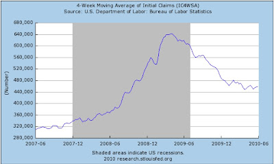
Markets reacted wildly to the disappointing employment numbers released by the BLS yesterday. The Dow dropped 323 points to a new year low and mass panic about the stability of the recovery has ensued. Economist reactions included disappointment and fear as the jobs report indicated an extremely weak recovery. The number looked at most was the monthly change in non-farm employment from the establishment data. This data usually does generate excitement in the bond and stock markets because it provides the strongest evidence as to whether the economy is creating jobs. It is important to look at total private job creation as that is the best indicator of the economies true direction. If you looked at just the total non-farm you would have seen that 431,000 jobs were created in May. This is misleading however because 390,000 of those were jobs created by the government (temporary Census workers) and only 41,000 created by the private sector. This number was terribly disappointing because it was down from 218,000 private sector jobs created in April which indicates that the economy is slowing down. The markets should have also looked at the slowly increasing average weekly hours which signals that business may accelerate hiring in the distant future. Delving deeper we see that overtime hours are in fact rising and have broken the 4 hour mark in May. Rising overtime hours is a precursor to new permanent hires because overtime can be quite costly for a company. Traditionally less than 4 hrs a week for a few months has indicated that layoffs may increase while above 4.5 hours usually indicates that increased hiring we be coming around the corner. Another thing to look at is weekly claims for unemployment insurance which has shown an ability to predict when the economy approaches a turning point. Initial unemployment insurance claims have been steadily falling since its peak in early 2009, but has seemed to level off around 460,000 which indicates that the economy is still weak and in danger of slipping back into contraction (possibly a double dip). A general rule of thumb is that when first-time claims stand above 400,000 for several weeks the economy may be in danger of slipping into a recession. A number below 400,000 suggests a recovery in underway and companies are laying off fewer workers.The above graph shows the two recessions of the early 1980's where initial unemployment claims originally leveled off slightly above 400,000 before the economy slipped into another contraction. I have a feeling that maybe the same thing will happen in the most recent scenario given that the economy is still in a very fragile state.