plot(1:10)
par("usr")
# [1] 0.64 10.36 0.64 10.36
# Now resetting y axis' usr coordinates:
par(usr=c(par("usr")[1:2], 101, 105))
points(1:5, 105:101, col="red")
axis(4)
plot(1:10)
par("usr")
# [1] 0.64 10.36 0.64 10.36
# Now resetting y axis' usr coordinates:
par(usr=c(par("usr")[1:2], 101, 105))
points(1:5, 105:101, col="red")
axis(4)
x <- rnorm(1000)
hist(x, freq = FALSE, col = "grey")
curve(dnorm, col = 2, add = TRUE)

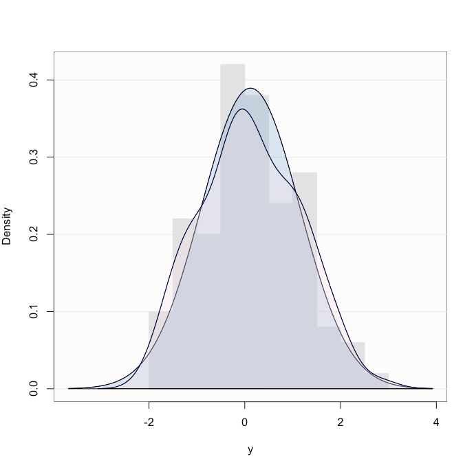
library(lessR)
# generate 100 random normal data values
y <- rnorm(100)
# normal curve and general density curves superimposed over histogram
# all defaults
color.density(y)
x <- c(0.0001, 0.0059, 0.0855, 0.9082)
y <- c(0.54, 0.813, 0.379, 0.35)
# create a two row matrix with x and y
height <- rbind(x, y)
# Use height and set 'beside = TRUE' to get pairs
# save the bar midpoints in 'mp'
# Set the bar pair labels to A:D
mp <- barplot(height, beside = TRUE,
ylim = c(0, 1), names.arg = LETTERS[1:4])
# Nel caso generale, i.e., che si usa di
# solito (height MUST be a matrix)
mp <- barplot(height, beside = TRUE)
# Draw the bar values above the bars
text(mp, height, labels = format(height, 4),
pos = 3, cex = .75)
# I have 4 tables like this:
satu <- array(c(5,15,20,68,29,54,84,119), dim=c(2,4), dimnames=list(c("Negative", "Positive"), c("Black", "Brown", "Red", "Blond")))
dua <- array(c(50,105,30,8,29,25,84,9), dim=c(2,4), dimnames=list(c("Negative", "Positive"), c("Black", "Brown", "Red", "Blond")))
tiga <- array(c(9,16,26,68,12,4,84,12), dim=c(2,4), dimnames=list(c("Negative", "Positive"), c("Black", "Brown", "Red", "Blond")))
empat <- array(c(25,13,50,78,19,34,84,101), dim=c(2,4), dimnames=list(c("Negative", "Positive"), c("Black", "Brown", "Red", "Blond")))
# rbind() the tables together
TAB <- rbind(satu, dua, tiga, empat)
# Do the barplot and save the bar midpoints
mp <- barplot(TAB, beside = TRUE, axisnames = FALSE)
# Add the individual bar labels
mtext(1, at = mp, text = c("N", "P"),
line = 0, cex = 0.5)
# Get the midpoints of each sequential pair of bars
# within each of the four groups
at <- t(sapply(seq(1, nrow(TAB), by = 2),
function(x) colMeans(mp[c(x, x+1), ])))
# Add the group labels for each pair
mtext(1, at = at, text = rep(c("satu", "dua", "tiga", "empat"), 4),
line = 1, cex = 0.75)
# Add the color labels for each group
mtext(1, at = colMeans(mp), text = c("Black", "Brown", "Red", "Blond"), line = 2)

x <- c( rnorm(50,10,2), rnorm(30,20,2) )
y <- 2+3*x + rnorm(80)
d.x <- density(x)
d.y <- density(y)
layout( matrix( c(0,2,2,1,3,3,1,3,3),ncol=3) )
plot(d.x$x, d.x$y, xlim=range(x), type='l')
plot(d.y$y, d.y$x, ylim=range(y), xlim=rev(range(d.y$y)), type='l')
plot(x,y, xlim=range(x), ylim=range(y) )
d1 <- cbind(rnorm(100), rnorm(100,3,1))
d2 <- cbind(rnorm(100), rnorm(100,1,1))
plot(d1[,1], d1[,2], xlim=range(c(d1[,1], d2[,1])), ylim=range(c(d1[,2], d2[,2])), col="blue", xlab="X", ylab="Y")
points(d2[,1], d2[,2], col="red")
points(loess.smooth(d1[,1], d1[,2]), type="l", col="blue")
points(loess.smooth(d2[,1], d2[,2]), type="l", col="red")

p <- seq(0.2,1.4,0.01)

x1 <- dnorm(p, 0.70, 0.12)

x2 <- dnorm(p, 0.90, 0.12)

plot(range(p), range(x1,x2), type = "n")

lines(p, x1, col = "red", lwd = 4, lty = 2)

lines(p, x2, col = "blue", lwd = 4)

polygon(c(p,p[1]), c(pmin(x1,x2),0), col = "grey")
Below an advanced example (Thanks to Blaž):
p <- seq(54,71,0.1)
x1 <- dnorm(p, 60, 1.5)
x2 <- dnorm(p, 65, 1.5)
par(mar=c(5.5, 4, 0.5, 0.5))
plot(range(p), range(x1,x2), type = "n", xlab="", ylab="", axes=FALSE)
box()
mtext(expression(bar(y)), side=1, line=1, adj=1.0, cex=2, col="black")
mtext("f"~(bar(y)), at=0.265, side=2, line=0.5, adj=1.0, las=2.0, cex=2, col="black")
axis(1, at=60, lab=mu[H[0]]~"=60", cex.axis=1.5, pos=-0.0165, tck=0.02)
axis(1, at=65, lab=mu[H[1]]~"=65", cex.axis=1.5, pos=-0.0165, tck=0.02)
axis(1, at=63.489, lab=y[k][","][zg]~"=63,489", pos=-0.035, tck=0.2)
axis(1, at=63.489, lab="", pos=-0.035, tck=-0.02)
lines(p, x1, col = "black")
lines(p, x2, col = "black")
line3 <- 63.5
polygon(c(line3, p[p<=line3], line3), c(0,x2[p<=line3],0), col = "grey23")
lines(p, x1, col = "black")
line <- 63.489
line1 <- 60
line2 <- 65
abline(v=line, col="black", lwd=1.5, lty = "dashed")
abline(v=line1, col="black", lwd=0.3, lty = "dashed")
abline(v=line2, col="black", lwd=0.3, lty = "dashed")
xt3 <- c(line,p[p>line],line)
yt3 <- c(0,x1[p>line],0)
polygon(xt3, yt3, col="grey")
legend("topright", inset=.05, c(expression(alpha), expression(beta)), fill=c("grey", "grey23"), cex=2)

