Visualizzazione post con etichetta barplot. Mostra tutti i post
Visualizzazione post con etichetta barplot. Mostra tutti i post
mercoledì 25 marzo 2009
Alternative implementations using ggplot2
Here and here, you can find alternative implementations of two plots (1, 2) I created time ago using R basic graphic. The author recreates the plots taking advantage of the excellent ggplot2 package.
lunedì 15 settembre 2008
Fitting text under a plot
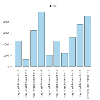
This is, REALLY, a basic tip, but, since I struggled for some time to fit long labels under a barplot I thought to share my solution for someone else's benefit.
As you can see (first image) the labels can not be displayed entirely:

The trick to fit text of whatever dimension is to use the parameter mar to control the margins of the plot.
from ?par:
'mar' A numerical vector of the form 'c(bottom, left, top, right)'
which gives the number of lines of margin to be specified on
the four sides of the plot. The default is 'c(5, 4, 4, 2) + 0.1'.
As you can see (first image) the labels can not be displayed entirely:
counts <- sample(c(1000:10000),10)
labels <-list()
for (i in 1:10) { labels[i] <-  paste("very long label number ",i,sep="")}
barplot( height=counts, names.arg=labels, horiz=F, las=2,col="lightblue", main="Before")
The trick to fit text of whatever dimension is to use the parameter mar to control the margins of the plot.
from ?par:
'mar' A numerical vector of the form 'c(bottom, left, top, right)'
which gives the number of lines of margin to be specified on
the four sides of the plot. The default is 'c(5, 4, 4, 2) + 0.1'.
op <- par(mar=c(11,4,4,2)) # the 10 allows the names.arg below the barplot
barplot( height=counts, names.arg=labels, horiz=F, las=2,col="skyblue", main="After")
rm(op)
venerdì 8 giugno 2007
Back to back historgram
library(Hmisc)
age <- rnorm(1000,50,10)
sex <- sample(c('female','male'),1000,TRUE)
out <- histbackback(split(age, sex), probability=TRUE, xlim=c(-.06,.06), main = 'Back to Back Histogram')
#! just adding color
barplot(-out$left, col="red" , horiz=TRUE, space=0, add=TRUE, axes=FALSE)
barplot(out$right, col="blue", horiz=TRUE, space=0, add=TRUE, axes=FALSE)
giovedì 10 maggio 2007
Barplots of two sets
x <- c(0.0001, 0.0059, 0.0855, 0.9082)
y <- c(0.54, 0.813, 0.379, 0.35)
# create a two row matrix with x and y
height <- rbind(x, y)
# Use height and set 'beside = TRUE' to get pairs
# save the bar midpoints in 'mp'
# Set the bar pair labels to A:D
mp <- barplot(height, beside = TRUE,
ylim = c(0, 1), names.arg = LETTERS[1:4])
# Nel caso generale, i.e., che si usa di
# solito (height MUST be a matrix)
mp <- barplot(height, beside = TRUE)
# Draw the bar values above the bars
text(mp, height, labels = format(height, 4),
pos = 3, cex = .75)
lunedì 7 maggio 2007
Make many barplot into one plot
# I have 4 tables like this:
satu <- array(c(5,15,20,68,29,54,84,119), dim=c(2,4), dimnames=list(c("Negative", "Positive"), c("Black", "Brown", "Red", "Blond")))
dua <- array(c(50,105,30,8,29,25,84,9), dim=c(2,4), dimnames=list(c("Negative", "Positive"), c("Black", "Brown", "Red", "Blond")))
tiga <- array(c(9,16,26,68,12,4,84,12), dim=c(2,4), dimnames=list(c("Negative", "Positive"), c("Black", "Brown", "Red", "Blond")))
empat <- array(c(25,13,50,78,19,34,84,101), dim=c(2,4), dimnames=list(c("Negative", "Positive"), c("Black", "Brown", "Red", "Blond")))
# rbind() the tables together
TAB <- rbind(satu, dua, tiga, empat)
# Do the barplot and save the bar midpoints
mp <- barplot(TAB, beside = TRUE, axisnames = FALSE)
# Add the individual bar labels
mtext(1, at = mp, text = c("N", "P"),
line = 0, cex = 0.5)
# Get the midpoints of each sequential pair of bars
# within each of the four groups
at <- t(sapply(seq(1, nrow(TAB), by = 2),
function(x) colMeans(mp[c(x, x+1), ])))
# Add the group labels for each pair
mtext(1, at = at, text = rep(c("satu", "dua", "tiga", "empat"), 4),
line = 1, cex = 0.75)
# Add the color labels for each group
mtext(1, at = colMeans(mp), text = c("Black", "Brown", "Red", "Blond"), line = 2)


Iscriviti a:
Commenti (Atom)