giovedì 8 gennaio 2009
The New York Times article about R
The New York Times published an article regarding the importance of R for data analysts.
lunedì 5 gennaio 2009
Statistical Visualizations - Part 2
Other 2 plots inspired by this post.

I find this 'bubbleplot' visualization quite interesting; unfortunately the R code I was capable to produce is quite poor and unsatisfactory. Any improvement or suggestion is more than welcome!
Anyway, this is the code:

You can find the first part of this 'series' with Yihui contributed code (Thanks again!) here.
>original
Europe Asia Americas Africa Oceania
1820-30 106487 36 11951 17 33333
1831-40 495681 53 33424 54 69911
1841-50 1597442 141 62469 55 53144
1851-60 2452577 41538 74720 210 29169
1861-70 2065141 64759 166607 312 18005
1871-80 2271925 124160 404044 358 11704
1881-90 4735484 69942 426967 857 13363
1891-00 3555352 74862 38972 350 18028
1901-10 8056040 323543 361888 7368 46547
1911-20 4321887 247236 1143671 8443 14574
1921-30 2463194 112059 1516716 6286 8954
1931-40 347566 16595 160037 1750 2483
1941-50 621147 37028 354804 7367 14693
1951-60 1325727 153249 996944 14092 25467
1961-70 1123492 427642 1716374 28954 25215
1971-80 800368 1588178 1982735 80779 41254
1981-90 761550 2738157 3615225 176893 46237
1991-00 1359737 2795672 4486806 354939 98263
2001-06 1073726 2265696 3037122 446792 185986
png("immigration_barplot_me.png", width = 1419, height = 736)
library(RColorBrewer) # take a look at http://www.personal.psu.edu/cab38/ColorBrewer/ColorBrewer_intro.html
# display.brewer.all()
FD.palette <- c("#984EA3","#377EB8","#4DAF4A","#FF7F00","#E41A1C")
options(scipen=10)
par(mar=c(6, 6, 3, 3), las=2)
data4bp <- t(original[,c(5,4,2,3,1)])
barplot( data4bp, beside=F,col=FD.palette, border=FD.palette, space=1, legend=F, ylab="Number of People", main="Migration to the United States by Source Region (1820 - 2006)", mgp=c(4.5,1,0) )
legend( "topleft", legend=rev(rownames(data4bp)), fill=rev(FD.palette) )
box()
dev.off()
I find this 'bubbleplot' visualization quite interesting; unfortunately the R code I was capable to produce is quite poor and unsatisfactory. Any improvement or suggestion is more than welcome!
Anyway, this is the code:
png("immigration_bubbleplot_me.png", width=1400, height=400)
par(mar=c(3, 6, 3, 2), col="grey85")
mag = 0.9
original.vec <- as.matrix(original)
dim(original.vec) <- NULL
symbols( rep(1:nrow(original),ncol(original)), rep(5:1, each=nrow(original)), circles = original.vec, inches=mag, ylim=c(1,6),fg="grey85", bg="grey20", ylab="", xlab="", xlim =range(1:nrow(original)), xaxt="n", yaxt="n", main="Immigration to the USA - 1821 to 2006", panel.first = grid())
axis(1, 1:nrow(original), labels=rownames(original), las=1, col="grey85")
axis(2, 1:ncol(original), labels=rev(colnames(original)), las=1, col="grey85")
dev.off()
You can find the first part of this 'series' with Yihui contributed code (Thanks again!) here.
martedì 23 dicembre 2008
Statistical Visualizations
Inspired by this interesting post, I decided to reproduce some of the plots using R code.
The data are c & p from here:


The data are c & p from here:
>original
     Europe    Asia Americas Africa Oceania
1820-30   106487      36    11951     17   33333
1831-40   495681      53    33424     54   69911
1841-50  1597442     141    62469     55   53144
1851-60  2452577   41538    74720    210   29169
1861-70  2065141   64759   166607    312   18005
1871-80  2271925  124160   404044    358   11704
1881-90  4735484   69942   426967    857   13363
1891-00  3555352   74862    38972    350   18028
1901-10  8056040  323543   361888   7368   46547
1911-20  4321887  247236  1143671   8443   14574
1921-30  2463194  112059  1516716   6286    8954
1931-40   347566   16595   160037   1750    2483
1941-50   621147   37028   354804   7367   14693
1951-60  1325727  153249   996944  14092   25467
1961-70  1123492  427642  1716374  28954   25215
1971-80   800368 1588178  1982735  80779   41254
1981-90   761550 2738157  3615225 176893   46237
1991-00  1359737 2795672  4486806 354939   98263
2001-06  1073726 2265696  3037122 446792  185986
png("immigration_log_scatter_BW.png", width = 560, height = 480)
par( mar=c(7, 7, 3, 3) )
plot( original$Europe, log="y", type="l", col="grey20", lty=1,
ylim=c(10, 10000000), xlab="Year Interval", ylab="Number of Immigrants Admitted to the United States",
lwd=2, xaxt='n', yaxt='n', mgp=c(4.5,1,0) ) # xaxt='n' an d yaxt='n'- do not show x and y axis
for (i in 2:dim(original)[[2]]){
lines(original[, i], type="l", lty=i, col="grey20")
}
axis(1, 1:dim(original)[[1]], rownames(original), las=2)
axis(2, at=c(10,100,1000,10000,100000,1000000,10000000), labels=c(10,100,1000,10000,100000,1000000,10000000), las=2, tck=1, col="grey85")
box()
legend( 14,400, legend=colnames(original), lty=c(1:5) )
dev.off()
png("immigration_stacked_chart.png", width = 560, height = 480)
library(plotrix)
par( mar=c(6, 6, 3, 3) , las=1)
colori4<-c("yellow", "darkred","green","brown1", "steelblue")
stackpoly( original[, 5:1], col=smoothColors(colori4), border=NA,stack=T, xaxlab=rownames(original),
        ylim=c(10,10000000), staxx=TRUE, axis4=F, main="Immigration to the USA - 1821 to 2006" )
legend("topleft", legend=colnames(original), fill=smoothColors(colori4)[5:1] )
dev.off()
giovedì 11 dicembre 2008
Tips from Jason
I want to thank Jason Vertrees for the following collection of useful tips!
(1) Use ~/.Rprofile for repeated environment initialization
(2) Ever have the problem of a large data frame only being displayed across 40% of your terminal window? Then, you can resize the R display to fit the size of your terminal window. Use the following "wideScreen" function:
(3) Get familiar with colorspace. For example, if you need to color data points across a range, you can easily do:
(4) Given an N-dimensional data set, (m instances in N dimensions), find the K-nearest neighbors to a given row/instance/point:
(5) A _VERY_ useful tip is to show the users the vast difference in speed between using for, apply, sapply, mapply and tapply. A for loop is typically very slow, where the ?apply family is great. You can use the apply vs for-loop in the neighbors function above with a timer on a large set to show the difference.
(6) Another useful tip, also in neighbors is generating difference vectors and their lengths:
(1) Use ~/.Rprofile for repeated environment initialization
(2) Ever have the problem of a large data frame only being displayed across 40% of your terminal window? Then, you can resize the R display to fit the size of your terminal window. Use the following "wideScreen" function:
# define wideScreen

wideScreen <- function() {

options(width=as.integer(Sys.getenv("COLUMNS")));

}

#

# Test wideScreen

#

a <- rnorm(100)

a

wideScreen()

# notice how the data fill the screen

a
(3) Get familiar with colorspace. For example, if you need to color data points across a range, you can easily do:
##

## lut.R -- small function that returns a cool pallete of nColors

##

require(colorspace)

lut <- function(nColors=20) {

return(hex(HSV(seq(0, 360, length=nColors)[-nColors], 1, 1)));

}

# Now use lut.

plot( rnorm(100), col=lut(100)[1:100] )

# Now use just a range; use colors near purple; pretty

# much like gettins subsections of rainbow.colors()

plot( rnorm(30), col=lut(100)[71:100] )
(4) Given an N-dimensional data set, (m instances in N dimensions), find the K-nearest neighbors to a given row/instance/point:
##

## neighbors -- find and return the K closest neighbors to "home"

##

neighbors <- function( dat, home, k=10 ) {

theHood <- apply( dat, 1, function(x) sqrt(sum((x-home)**2)))

return(order(theHood)[1:k] )

}

# Use it.  Create a random 10x10 matrix and find which rows

# in D are closest (Euclidean-wise) to row 1.

d <- matrix( rnorm(100), nrow=10, ncol=10)

neighbors(d, d[1,], k=3)
(5) A _VERY_ useful tip is to show the users the vast difference in speed between using for, apply, sapply, mapply and tapply. A for loop is typically very slow, where the ?apply family is great. You can use the apply vs for-loop in the neighbors function above with a timer on a large set to show the difference.
(6) Another useful tip, also in neighbors is generating difference vectors and their lengths:
# the difference vector between two vectors is very easy,

c <- a -b

# now the vector length (how far apart in Euclidean space these two points are)

sqrt(sum(c**2))mercoledì 3 dicembre 2008
Retrieving the author of a script
I know that the best/recommended way to manage the authoring of R code consists in building a package containing a DESCRIPTION file.
Nevertheless, I wrote a very basic function retrieving the name of the authors of a script (or any text file) if these names are written within the first three rows of the file (easily changeable) with this format:
##
## Author:Pinco Palla, Paolino Paperino, Topo Gigio
##
The function:
Nevertheless, I wrote a very basic function retrieving the name of the authors of a script (or any text file) if these names are written within the first three rows of the file (easily changeable) with this format:
##
## Author:Pinco Palla, Paolino Paperino, Topo Gigio
##
The function:
catch.the.name <- function(filename="myscript.R"){

require(gdata)

str <- scan(filename, what='character', nlines=3, sep="\t", quiet=TRUE)

author <- grep("Author:([^ ]+)", str, value=T)

author <-sub('^.*Author:', "", author)

author <-strsplit(author,",")

author <- trim(author)

return(author[[1]])

}
giovedì 23 ottobre 2008
R Upgrade on Mac Os X 10.5.5 (Leopard)
To reinstall packages from an old version of R to a new one.
In the old version type:
Install the most recent version of R:
Download the most recent version of R from The Comprehensive R Archive Network (CRAN)
Build from source new R version (see this FAQ).
From inside the decompressed R-?.?.? directory type:
Install BioConductor packages using the biocLite.R installation script.
In an R command window, type the following:
If you have other Bioconductor packages missing from the old installation:
Re-install the missing packages from CRAN:
If you use some package created by Henrik Bengtsson:
If you find your X11 broken after the installation procedure (it happens every time to me, at least on Leopard) install the XQuartz App from here.
Update: If you need to install a recent version of R on old hardware (Power PC G4) and OS (Mac OS X 10.4 here) this post can be useful.
In the old version type:
tmp <- installed.packages()

installedpkgs <- as.vector(tmp[is.na(tmp[,"Priority"]), 1])

save(installedpkgs, file="installed_old.rda")
Install the most recent version of R:
Download the most recent version of R from The Comprehensive R Archive Network (CRAN)
# To wipe the old R version

rm -rf /Library/Frameworks/R.framework /Applications/R.app

rm -rf /Library/Receipts/R-*
Build from source new R version (see this FAQ).
From inside the decompressed R-?.?.? directory type:
# See Section 2.2 of RMacOSX FAQ for the flag description

./configure --with-blas='-framework vecLib' --enable-BLAS-shlib

make

sudo make install
Install BioConductor packages using the biocLite.R installation script.
In an R command window, type the following:
source("http://bioconductor.org/biocLite.R")

chooseBioCmirror()

biocLite()
If you have other Bioconductor packages missing from the old installation:
load("installed_old.rda")

tmp <- installed.packages()

installedpkgs.new <- as.vector(tmp[is.na(tmp[,"Priority"]), 1])

missing <- setdiff(installedpkgs, installedpkgs.new)

for (i in 1:length(missing)) biocLite(missing[i])
Re-install the missing packages from CRAN:
load("installed_old.rda")

tmp <- installed.packages()

installedpkgs.new <- as.vector(tmp[is.na(tmp[,"Priority"]), 1])

missing <- setdiff(installedpkgs, installedpkgs.new)

install.packages(missing)

update.packages()
If you use some package created by Henrik Bengtsson:
source("http://www.braju.com/R/hbLite.R")

hbLite()
If you find your X11 broken after the installation procedure (it happens every time to me, at least on Leopard) install the XQuartz App from here.
Update: If you need to install a recent version of R on old hardware (Power PC G4) and OS (Mac OS X 10.4 here) this post can be useful.
lunedì 15 settembre 2008
Fitting text under a plot
This is, REALLY, a basic tip, but, since I struggled for some time to fit long labels under a barplot I thought to share my solution for someone else's benefit.
As you can see (first image) the labels can not be displayed entirely:

The trick to fit text of whatever dimension is to use the parameter mar to control the margins of the plot.
from ?par:
'mar' A numerical vector of the form 'c(bottom, left, top, right)'
which gives the number of lines of margin to be specified on
the four sides of the plot. The default is 'c(5, 4, 4, 2) + 0.1'.
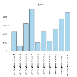
As you can see (first image) the labels can not be displayed entirely:
counts <- sample(c(1000:10000),10)
labels <-list()
for (i in 1:10) { labels[i] <-  paste("very long label number ",i,sep="")}
barplot( height=counts, names.arg=labels, horiz=F, las=2,col="lightblue", main="Before")
The trick to fit text of whatever dimension is to use the parameter mar to control the margins of the plot.
from ?par:
'mar' A numerical vector of the form 'c(bottom, left, top, right)'
which gives the number of lines of margin to be specified on
the four sides of the plot. The default is 'c(5, 4, 4, 2) + 0.1'.
op <- par(mar=c(11,4,4,2)) # the 10 allows the names.arg below the barplot
barplot( height=counts, names.arg=labels, horiz=F, las=2,col="skyblue", main="After")
rm(op)
Iscriviti a:
Commenti (Atom)